Monday, April 29, 2013

Denis Kitchen Identity

 Front and back side of Denis Kitchen Art Agency Business Card


 Letterhead for the Denis Kitchen Art Agency


 Mailing Envelope for the Denis Kitchen Art Agency


 Front and back side of the Denis Kitchen Publishing Company Business Card


Li'l Abner collectibles Inquiry Card


Nancy and Sluggo collectibles Inquiry Card


I've known Denis Kitchen, for about 20 years. Denis has had several very successful careers. But probably the thing he is best known for, is his publishing company, Kitchen Sink Press. The company produced high quality comic related material, along with great production values. I had been a fan for years, when I finally got the courage to contact him. I sent him a package with samples of my work, and told him I would love the opportunity to work with him. We communicated back and forth for about three years, before a project finally happened. We ended up putting together the "Scenes From the Xenozoic Age" wooden boxed portfolio. It was an immediate sell out. It was also nominated for an Eisner Award. Which unfortunately, I lost to Chris Ware. I hope it's not deja vu all over again this year!

Last year, Denis wanted to re-do his identity system. He asked me if I would be interested in doing a new business card, letterhead, and envelope for him. Actually designing those types of things are some  of my favorite things to do, so I eagerly said, "yes." Denis also is a collector of Li'l Abner and Nancy merchandise, so he wanted cards that he could hand out designed too. What you see above, is the results of those designs.


Thursday, April 18, 2013

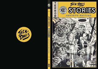
Jack Davis EC Stories Artist's Edition

 Regular Edition Cover


 Variant Edition Cover


 Title Page


 Credits Page


Contents Page


I would say that most people are familiar with the art of Jack Davis. They may not know him by name, but they certainly recognize his style. If you grew up reading MAD magazine, you would remember his movie parodies, and appreciate his ability to capture likenesses, which were always spot-on. Davis' work was also on display, as covers, to many nationally recognized magazines. Another thing he's  known for is his fabulous sports caricatures.

But Jack really first came to prominence, in the pages of EC comics. As one of the stable of outstanding artists for that publisher, he rose to fame with his ability to illustrate a diverse range of stories. He was able to accurately depict historical tales, and then without missing a beat, create something absolutely terrifying for the horror genre. His lush brushwork was beautiful to behold regardless of the story.

The design template for these books is based on the look of the actual comic. However, one of the things I wasn't happy with, was the proportions of the original comic. The masthead and title portion of the EC comics, took up almost half of the cover! I reduced that area down so that I could increase what I considered to be the most important element on the cover... the artwork! This rule also applied to the previous book based on an EC artist, the Wally Wood Artist's Edition. I plan on keeping this consistent with future volumes dedicated to that immensely talented crew of EC artists.  Did you get that subtle hint? There will be more books focusing on individual EC artists! Yeah!

Monday, April 15, 2013

Will Eisner's Spirit Artist's Edition

 Credits spread


 Story divider page


 Story divider page


 Story divider page


 Will Eisner's bio page


Will Eisner's Spirit Artist's Edition variant cover


Here's a project that took longer than was originally intended. Part of the challenge and the joy of doing these artist's edition books, is locating, securing, and scanning the original art for these collections. Sometimes during the process, there can be bumps in the road. But like anything, if you want it to be the best it possibly can be, sometimes more time is required. I think in this case, it was worth the wait. The art in this book, is breath-taking. If you are a fan of Will Eisner, I think it would be very hard to resist purchasing this volume.

When this book was first announced, John Lind was going to be designing it. John is a very talented designer who has designed numerous books with his partner Denis Kitchen. One of my favorites is, "Crime Does Not Pay, Blackjacked and Pistol Whipped" book for Dark Horse. John was able to design the cover to the regular edition of the Spirit book, but because of delays and scheduling conflicts, he was unable to design the rest of the book. But, in the end, that was good news for me.

When designing this book, I wanted to emphasis the noir aspects of the art. Eisner was so talented in creating atmosphere through light and shadows. I wanted to design in that same direction. I used individual images, and bits and pieces of panel art to re-construct new situations and scenarios. I wanted the chapter dividers I created, to maintain the moodiness of the book. I chose colors that were "smokey" and somewhat dirty, then I added bright hi-lights to the images. I wanted the art to have a strong direct light source, that in turn would pull the figures out of the dark. It adds a sense of danger and drama. It was quite a treat to work with Mr. Eisner's highly revered characters, and be able to add my humble spin to them!

Boomchu


Rough sketch by Tyler's buddy

Final logo design


Working on a logo for someone, based on their sketch, can either be fun, or a total nightmare. My son, Tyler, asked me if I could help him color a logo for his new business. Tyler and a couple of his friends, have decided to start a business doing video and audio production work. He explained to me, that one of his friends had drawn up a logo, that he liked, and was wondering if I could just add color to it.

Sight unseen, I somehow knew, it wouldn't be a matter of just adding color to an existing logo. I kind of braced myself for the worst, when the logo was revealed to me. It ended up being a pencil drawing with a lot of graphite shading. The good news was, the design of the logo, really wasn't bad. I talked about the things I would change and how I would make it a stronger design. Tyler pointed out to me all of the things he really liked about it, and how and why he had picked certain design elements.

I tried to be respectful to the original design, yet try to improve it without compromising the concept. It was challenging to not inject my design preferences, and turn it into my vision. All in all I think it turned out well. Tyler was very pleased with the end result, and told me that's the reason he wanted me to do it... because I was a professional! Anything I can do to help you, that's why I'm here. Good luck to Boomchu, I hope it's an exciting and lucrative experience!