Regular Edition Cover

Variant Cover

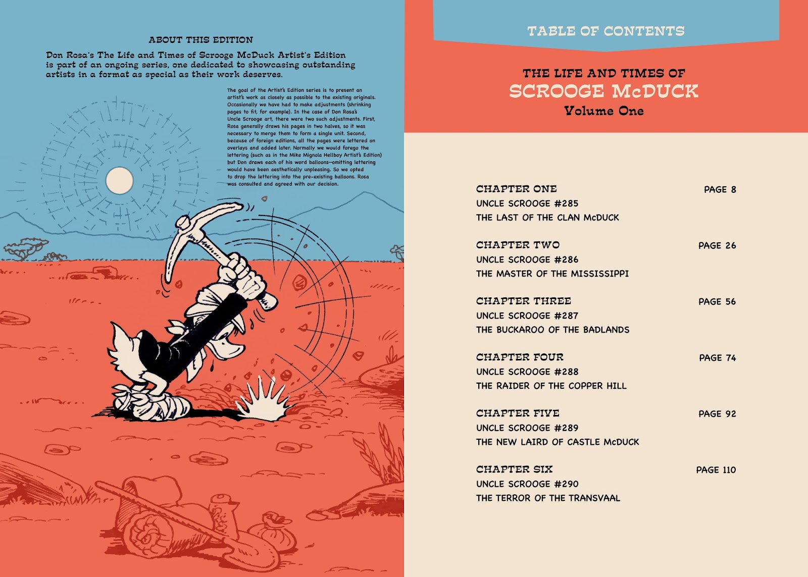
Title Page

Pages 2-3

Pages 4-5
With Eric Powell's The Goon, I was dealing with a little different style of art. Powell's art is very dense and textured. Since he fully paints the pages, there is a tonal quality that isn't in most comic book art. When designing this, I wanted to attempt to give the design pages the same look as his story pages. With the design, you never want to detract from the real focus of the book, which would be the story pages. I use a limited color palette to add variety, but not overwhelm. I tried to recreate the "wash" feel of his art. The book should have rhythm and feel continuous. The design pages shouldn't cause you to stop and think, "This looks out-of-place."
Powell's art really is very amazing. He has an ability to go from slapstick to horror, and it all works. The light and shadows are used with the greatest of dramatic effect. The gray tones and layering of his art adds dimension and mass and certainly fits the storytelling. Good stuff!