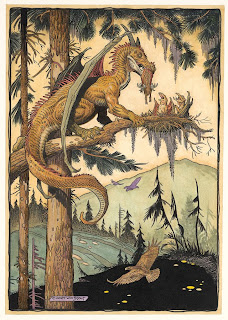
Monday, September 20, 2010

Xenozoic Book

Chapter Divider


Title Page


Final Cover Design

It's always a pleasure to work on projects with people who's work you admire. Xenozoic is certainly one of those projects. Mark Schultz's art is just plain beautiful to look at. When we started having dialog about how to go about designing this book, we decided the best approach, was to show a lot of white space on the new pages. Because Mark's artwork is so dense, it seemed to make sense to break things up with pages that would give your eye some resting places. So the approach was to simplify. With the chapter dividers, Mark did 20+ new illustrations, each representing an iconic interpretation of that story. The chapter title was discreet and slightly kerned out, giving it a look of sophistication. A small trilobite logo was placed at the bottom of the page to balance everything out.

The title page was set-up much the same way, with lots of white space. It's interesting how using white space becomes very much, a design element. I think too many times there is a desire to jam way too much information onto a page. What becomes the focal point? This way you can take in all the information, and possibly linger on it, longer.

There were a few changes to the final cover, one of them was obviously using Mark's painted version of his artwork. Mark also wanted to go back to the title type that wasn't angled, but still looked distressed. It represented something stronger and bolder. I think this falls into the same philosophy as the inside design, simpler is better. I think it's eye catching and very handsome as a final solution.

Check out John Fleskes blog (Flesk Publications) for a more in depth description of Mark's process of creating the cover illustration.

Sunday, September 5, 2010

Menagerie: The Art of Animals

First design for the invitation


Second design for the invitation


2 t-shirt designs based on design elements from the invitations


Final invitation design

In May I got a call from Joan Adan, curator for the Forest Lawn Museum. She gave me a call based on a recommendation from my good friend William Stout. She was wondering if I'd be interested in designing an invitation and show catalog for an exhibit that was opening up in August. The show was to be titled Menagerie: The Art of Animals, it was going to include original artwork by many very talented artists and illustrators. The list included, Drew Struzan, Ian McCaig, Marc Davis, Charles Russell, and Charles Knight. William Stout was co-curating the show, showing eight of his paintings, lending several pieces from his personal collection of other artists, and doing a new painting that would serve as both the cover to the invitation and the catalog.

What an enjoyable experience this ended up being. Starting out with a brand new beautiful painting by William Stout, it was hard not to be enthused about this project. Based on the painting by Bill, anything I did would end up looking good.

The first 2 invitation designs, I was trying to create an icon to go with the title. I wanted a symbol that could be used to identify and promote the show. I also thought it would be fun to create t-shirts to sell at the show or wear to promote the event. In the first attempt, I was playing off using a simplified version of Bill's beret wearing chimpanzee (think Paul Frank).

The second version, I wanted an elephant interacting with the type, as if it were holding up the word Menagerie. In both of them, I used a background that resembled a pattern that might be found on an animal (giraffe). Joan wanted to simplify the design, and felt with the icons, it was too busy. So the final attempt was to strip it down to it's most important basic elements and tweak the color to follow closer with the palette of Bill's painting.

Check out William Stout's website for a really neat process and explanation of how he did the final painting for the show.

Saturday, September 4, 2010

Award Winner

Well, I just found out, that The Rocketeer Complete Adventures Deluxe Edition won 3 Harvey Awards! I think that is quite exciting. Here's an explanation of who he is, and what they represent...

BALTIMORE, MD (July 11, 2010) -- The 2009 Harvey Awards Nominees have been announced with the release of the final ballot, presented by the Executive Committees of the Harvey Awards and the Baltimore Comic-Con. Named in honor of the late Harvey Kurtzman, one of the industry’s most innovative talents, the Harvey Awards recognize outstanding work in comics and sequential art. They will be presented August 28, 2010 in Baltimore, MD, in conjunction with the Baltimore Comic-Con.

Nominations for the Harvey Awards are selected exclusively by creators - those who write, draw, ink, letter, color, design, edit or are otherwise involved in a creative capacity in the comics field. They are the only industry awards both nominated and selected by the full body of comic book professionals.


It won awards for "Best Domestic Reprint Project," and also "Special Award for Excellence in Presentation" and Laura Martin won for best colorist on the project.


More exciting news, back in July, the book also won 2 Eisner awards. Here's an explanation on those awards...

The Will Eisner Comic Industry Award, commonly shortened to the Eisner Award, is a prize given for creative achievement in American comic books. It is named in honor of the pioneering writer and artist Will Eisner,and includes the comics industry’s Hall of Fame. Each category is nominated by a five-member panel, voted on by comic-book professionals, and presented at the annual Comic-Con International convention held in San Diego, California.

The book won the award for "Best Archival Collection/Project—Comic Books," and Laura Martin, once again won for colorist on this book.

I'm thrilled and delighted, It really was quite the team effort to put the book together. Thanks to Scott Dunbier for allowing me to do the book as I had envisioned. Also thanks should go to Kelvin Mao, who worked very hard (night and day) on doing whatever was necessary to see the book was done to the highest level of expectations.

How's that for a speech? Since I didn't get a chance to give one for real, I thought I would take the chance and do it here.


As far as the book goes, it sold out pretty quickly, however, the good news is, it is being reprinted. The image above shows the new variation on the slipcase for the book. This will help distinguish this from the first printing. Otherwise, everything else will be the same as the first printing. I think...this is coming out in October.

Sunday, June 6, 2010

Midget Racers Quarterly


Here's a cover to Midget Racers Quarterly, featuring Johnny Comet. So, you say you've never seen or heard of this magazine? That's because this is the only issue in existence. I thought it would be fun to put some promotional material for the book together for San Diego Comic-Con. I thought by creating this faux magazine, it would put some smiles on people's faces. I printed out four of these covers, trimmed them out, and then mounted them to 1950s era Hot Rod magazine guts. I added a little more aging to the cover and I think it looks pretty convincing. It sure smells convincing. Of course to preserve the whole illusion, I quickly made sure to insert the magazines into mylar sleeves. These will be on display at the Vanguard booth, along with Johnny Comet pit crew T's and packaged balloon racing cars. It's all for fun!!

Johnny Comet spreads

The spread intoducing the Sunday strips


The spread introducing the daily strips


A page dividing one of the sections of the book


The title spread to the book


Can I be honest? I'm so loving working on this Johnny Comet book. What a great opportunity to be able to design a book dedicated to one of Frank Frazetta's comic strips. I really love everything about this strip. I'm a big fan of the 50s era. I think the best designed cars came from that period, along with furniture design, and graphic design. It's been a joy, to try to take existing Frazetta art, and give it a whole fresh new approach.

One of the design approaches was to collage his illustrations with actual photographs from that era. It kind of gives the illusion that the situations and cast of Johnny Comet were part of history. I also wanted to throw in car ads and other images to give reference to that time. These represent just a few examples of the design work going into the book.

The Strand Book Store NYC


A couple of months ago, I came across a contest to design canvas tote bags for the Strand bookstore in New York City. They had hired several different comic books artists (including Seth and Adrian Tomine) to do a new bag each year in the past. However, this year they had a contest to determine who would provide the art for their new bag. I thought the prizes were pretty cool, (hundreds of dollars worth of books from Fantagraphics, and Drawn and Quarterly, plus the exposure of your artwork on the bag) so I decided to enter. I noticed that Francoise Mouly, who is the art editor for the New Yorker, was one of the judges. I was hoping, to maybe get some opportunity, through some fluke, to possibly do work for her. Anyway, with all these possibilities, I decided to enter the contest.

These things are always a little tricky, because you don't know the personal taste or what might appeal to the judges in a contest like this. It could have something to do with what they ate that day or what kind of mood they were in. I tried to spread out my design style as much as possible, to give me the best chances.

The first design was an attempt to be clever around the idea of a bookworm. I pushed the whole retro feel with colors and iconic images. I thought it would look good as a strong graphic image and advertisement on the side of the bag.

The second one was more of a bouncy, cartoony, contemporary approach. Again I wanted this to be a strong, graphic, highly visible image when printed on the bag. I thought the idea of "What's your story?" was kind of funny with its double meaning.

The third design was meant to be more childlike in its execution. It's big, bold, and simple in it's shapes and form. I wanted it to be cute and heartwarming. I thought it was the most sentimental of all of the designs. I felt it kind of had a European feel to it.

So here's the good/bad news, there were over 800 entries into the contest. Out of that many participants, 2 of my designs were placed in the top 20. The first and second design made the cut. When I was informed that I had "won" they requested I provide them with hi-res versions of the art so they could use it in a slide show sponsored by the School of Visual Arts. They were also going to post the winners on line and some other stuff, which I don't remember. I told them I was going to pass, when I was asked why, I told them I entered the contest to win first place, which I hadn't, so why continue to be part of this. I don't want to sound like a sore loser, but really, what would the point have been? Who remembers runner-ups?

After looking over the designs, I don't think I would have done anything differently. You can never predict what is going to appeal to anyone. I think ultimately, you have to stay true to your own vision, and feel content that you did the best job you could. I'm actually okay with that.

Maybe next year...

Monday, May 17, 2010

The Rocketeer Artist's Edition

This is the cover to the new Rocketeer Artist's Edition book


This is the endpapers for the front part of the book.


This is the title page for the book


This is the credit page spread for the book


This is a sample page from the book


This was IDW's editor Scott Dunbier's dream project. This book contains the original artwork from the entire Rocketeer story shot at original size. That means the size of the book is 12" x 17." It is spectacular in it's enormity. The book weighs in at about 4 pounds. It is a hefty, beefy, masculine volume.

Even though the artwork is basically black and white, all the pages were scanned in color. Because of this, you can see all the blueline art that was part of the creation process. This is the closest you can come to looking at a Dave Steven's original without owning one. When it comes to illustration work, I'm kind of a process junkie. I love seeing all of the peliminary sketches and design that go into creating a page of art. These pages are certainly an eye opening experience. The detail that Dave puts into each panel can only be appreciated at it's actual size. It was almost like discovering his art for the first time. His ability to create atmosphere and character expression, along with the craftsmanship of inking with a brush really shines on these pages. This takes the idea of "funny books" to a whole new level. The stuff is really beautiful!

The book will be sold directly through IDW, so check out their website. I have a feeling this will sell out rather quickly, remember the Deluxe Edition of the Rocketeer? The price on it is $100.00, not really cheap, but certainly worth it for something as unique and beautiful as this.

Tuesday, March 30, 2010

Xenozoic Part 1

Mark's original rough sketch with his type treatment suggestion.


An attempt at adding a dynamic flair to the type.


Another "experiment" with the title font


Another happy day for me! Flesk publications is going to reprint the entire Xenozoic Tales saga in one volume. It's been seven years since these stories were last printed, and this is the first time they will all appear in one fantastic volume. I'm excited because, this is one of my favorite adventure stories of all time, Mark's art is absolutely gorgeous, and I get to design the book.

Mark started the whole process by not only providing the cover sketch, but also possible type treatment for the title. Many years ago, when Mark and I started working together, we wanted to establish an ongoing look that could be carried through from project to project, with the use of a recognizable type font. The font became "Futura," it has such a bold clean masculine look to it, that it seemed like a perfect fit, for all things Xenozoic. The challenge is how to use the font without it becoming repetitive or boring. I experimented with various ways of tweaking it to try to keep it vital and interesting. The first attempt looked too much like the Superman title treatment and the second one just looked too much like crap. Even though they both were failures, Mark was very kind and considerate in his remarks about them. I was hoping he'd give me another chance...

Xenozoic Part 2

Mark's final black and white art with new type.


Different type variation


Mark's original water colored color guide


First attempt with digital colored art and colored type


Final colored cover for solicitation.


Mark next provided the finished black and white inked artwork. Taking the Futura type font I next went through the process of distressing it, making it look less pristine and more disintegrated. The goal of this cover was to give it a "pulpy" rustic look. I gave Mark a version of the title that was pretty straight forward, close to what he had originally envisioned. I also gave him a version of the title using a condensed version of the font and adding a slight slant to the characters. The second version felt more appropriate to the style of the book and the illustration. Mark and John agreed to using that version.

Mark then printed out a copy of the black and white art and created a water color guideline of how he wanted the cover to look. I used this guideline to create a digitally colored version of the cover. Mark cautioned me that the colors had gotten a little dirty because of painting on top of a photo copy, so he told me to lighten them somewhat. Because of time constraints we had to create a substitute cover, so it could be used for solicitation purposes. Mark's intention is to actually water color the artwork himself for the "real" printed cover. Using his black and white inked art, Mark will make a print out on water color paper and apply the colors to it. A second print out will be made of just the black and white artwork that will be registered on top of the color and then used for printing. I think this is the first time that he has actually hand colored any of his cover images. I am very excited to see the results of his version of the painted cover.

After getting it digitally colored, I put in the black banner with Mark's name at the top and applied the title. I started second guessing myself and thought the banner at the top should appear more clean, and less busted up for better legibility of Mark's name. I matched the color of Jack's shirt to the title, thinking it would be a good balance of reds, I also added the drop shadow to give it more weight and punch.

Mark suggested eliminating the drop shadow and returning the banner at the top to the distressed version. He also wanted the red to be a darker more blood red version, (he thought my version was too feminine, I get that a lot). After a few more attempts at getting the red the right color, the cover was given the final nod of approval.

Thursday, March 4, 2010

Frazetta's Johnny Comet

Cover for the softcover version of the book.


Cover for the hardcover version of the book.


Well, based on the idea, that there was an ad printed in the latest issue of Comic-Con magazine announcing this book, I guess it's safe to reveal my newest designs.

Sometimes projects come along that get me giddy and scratch my itch. This was one of them. Based on the title of this blog, it's safe to assume, I kind of like retro themed things. This assignment put into one package so many different things that I'm passionate about. First we have the 1950s... great fashion, interior design, color palettes, and car designs. Then we add the excitement and danger of rollicking midget car racing. Next we throw in a glorious black and white newspaper strip. Finally, to top it all off, we have Frank Frazetta! How can it get any better than that?

All the art in this book, are new scans from Frank's personal copies of proofs and tear sheets. The detail is spectacular. There have been other collections of this comic strip, but never has the art been this sharp and crisp. All the delicate inking lines that Frank originally applied to his drawings can finally now be seen as he had intended. It's really an eye opening experience. Having the chance to work on Dave Steven's Rocketeer book gave me lots of time to savor his artwork, but working on this book showed me how much Frank's work on this strip influenced Dave.

When designing the cover, I wanted to take all of my influences from the 50's (hot rod magazines, service station logos and products, and midget car races), and add some contemporary treatments, and roll them together to create something both old and new. Since Frank was not suppling new art for this cover, I got a chance to dig through his existing art and try to come up with an appropriate cover image. This was great fun, studying and dissecting each panel from the strips. I like how this cover turned out a lot, (I hope that doesn't come across as pompous). It to me, has qualities of a retro-flavored racing program or hot rod magazine, but I think it still retains it's new car feel.

For the slipcase, I used exploitive movie posters from the 50's for inspiration. There are some great hot rod and juvenile delinquent movies from that era. The only thing I would have liked to add, would have been tears and creases. I think that would have been cool (the publisher didn't go for that idea).

This is one of the few times I've actually created a logo for the title of the book. I would like to take the mastheads or logotypes and print them on black-t's. I think that would be a great merchandising tool. I would wear one! Better yet, what if they were turned into patches, and sewn on the back of jackets?

This is another "dream come true" project. I'm sure most comic book artists would agree that Frank's work has been hugely influential to them. I'm thrilled to be part of this. This will be the first, of a four book library, reprinting Frank's comic book work. I want to add other fun elements to this book to try to make it a complete historical record, of not only the strip but, of that unique period of time.

Climb on board and buckle your seat belt, we are going for a fast ride!

Friday, February 26, 2010

Hannah Hoodie

This was the header card design that went with the poly bag
packaged tank top


This was my attempt, along with Mark Schultz to do something fashionable. We wanted to create something using Mark's characters that fit in with current fashion trends. Mark provided the copy, and the image of Hannah with the serpent, and I built the design off of that. We both wanted this to have a tattoo vibe, but maintain a feminine quality. It has a sleeve print along with faux jewels attached around the logo design.

We sold these at the 2009 San Diego Comic-Con, along with tank tops with the same design. I think the influence of the design is rather obvious, but we felt with a softer palette, we might be able to do something a little more attractive. This might be worth pursuing more in the future. Maybe next time we will include the male audience.

Thursday, February 25, 2010

Frazetta Classics Logo


This is the last logo posting for a while. This is a logo that was completed a couple of weeks ago. This may or may not be part of a project I'm currently working on...???!!!

Tuesday, February 23, 2010

Al Williamson Archive


This is a progression of cover designs for the new Al Williamson Archive book from Flesk Publications. This book will be the first in a series of books printing Al's preliminary sketches and visual brainstorms. John Fleskes and Mark Schultz spent several days at Al's house going through the stacks and stacks of original drawings and scanning them for this book. This will be the first time these images appear in print. This book and future volumes will be an amazing historical record of Al's work over a 55+ year period.

I have to admit this was a bit of a struggle for me. I wasn't sure what to do with the cover. I didn't want this to look like a traditional sketchbook that is seen in the comic book industry. It's always a challenge for me to design books for people who's work I cherish. It's a great honor and privilege to design packages that contain such inspiring work... I don't want to screw up.

After going through the hundreds of images, John and Mark had decided on the image they wanted for the cover, now came my turn. John told me I could do what I wanted with the image, I could crop it anyway I saw fit, or I could run the image full-bleed off the edges.

The first cover at the top, I tried re-using the "tag" idea from the Bama book. I thought it had the look of how you might label some kind of important document. I thought it fit with the archive idea. I added transparent colors to give the illusion the art was done on tracing paper. I also thought it would help lighten up all of the black areas. I wanted this to feel airy and sketch-like.

The second cover, I decided to frame the art, and not allow it to float. I tried adding a vertical title box to give the cover more sensation of height. I added the thin rules in the black area to give the feeling of movement to re-enforce the action in the drawing. I also created an asymmetrical balance to add to the dynamic tension.

The third cover, followed the initial direction of the second cover. Instead of a vertical title box I used the more traditional horizontal approach. I wanted this to have more of a 50's vibe, since that is when the majority of Al's work was done, so I used that refrigerator looking font. I used the diagonal color blocks to again, create movement.

John liked the first and second cover designs. He was concerned however, that with the second design, that Al's name didn't appear large enough. He then left it up to me to figure out which cover to go forward with, and how to solve some of the problems. The fourth cover, is taking into account all the suggestions, and mashing together the ideas that worked from the 3 designs, and creating a hybrid. And that folks, is how it works.


Friday, February 12, 2010

James Bama Sketchbook Covers


Here's a progression of cover designs for the James Bama Sketchbook, done for Flesk Publications. When John asked me if I wanted to design the cover for this collection, I was thrilled. I've been a big fan of James Bama's work for decades. My first exposure, like most people, were through his painted covers of the "Doc Savage" series of paperbacks. There was certainly something very unique and exciting about his paintings. Flesk Publications has a beautiful book devoted to the history of James Bama and his work, I recommend it to anyone who seeks to get more information on this artist and to see reproductions of his work.

The cover at the very top, was my first attempt at putting a cover together. Because this sketchbook represented drawings he had done as he visited different parts of the world, I wanted it to look like a travelogue. I thought the title portion of the book could look similar to a passport, with stamps and a certain 3 dimensional quality to it. I also wanted to focus on just one image to make it both simple and strong. John Fleskes felt because the painting I used, was actually one of a series, that I should include the other three images. In my second attempt, I still wanted this to feel like a working sketchbook, so I thought placing the images on the cover somewhat randomly, had a feeling of them being tossed on top of the cover as they were completed. I wanted the cover to feel energetic, and spontaneous, just like the sketches on the inside.

Unfortunately, Bama didn't agree. So, on the third attempt I made the cover more formal. I also created a faux bandwrap that contains the title. I think this gives it a look of more sophistication and a certain preciousness.

I still haven't given up on using that "passport" idea, I'm thinking of re-using it for another cover I'm working on now. Maybe it wasn't appropriate for the Bama sketchbook, but I think there might be more applications for it. Always remember..."re-cycle, re-use." I like to do my part for the environment!?

Thursday, January 21, 2010

The Rocketeer Review in Entertainment Weekly

BOOK REVIEW

The Rocketeer (2010)

EW's GRADE
A

DETAILSRelease Date: Jan 13, 2010; Writer: Dave Stevens; Genres: Comic Books/Graphic Novels, Fiction; Publisher: IDW Publishing

The Rocketeer: The Complete Collection by Dave Stevens | The Rocketeer, Dave Stevens
The Rocketeer: The Complete Collection by Dave Stevens

Dave Stevens, who died of leukemia at 52 in 2008, was a craftsman, a comics legend. His 1980s Rocketeer comics — a throwback to 1930s pulp adventure tales — weren't big sellers, but they were an extraordinary evocation of a bygone era, full of erotica and élan. He also drew storyboards for everything from Raiders of the Lost Ark to Michael Jackson's ''Thriller'' video, and was single-handedly responsible for the rediscovery of '50s pinup model Bettie Page, the inspiration for Rocketeer Cliff Secord's curvy crush Betty. These gorgeous color reproductions of Stevens' meticulous work serve as a fine testament to his artistry. A


Sunday, January 17, 2010

2 New Stout Titles

This is the cover for the book of female images


This is the cover for the book on dragons, monsters, witches, etc


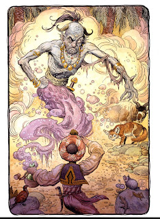
This is a story book illustration painting from the book

This is from a series of prints done for the Wizard of Oz

Here's a dragon painting from the book


Okay, good news. I'm currently working on two more books with William Stout. Each of these two books will be 48 pages and feature a wide variety of paintings Bill has done over the last few years. Posted above, you can see the two different covers of the books. They kind of represent a male and female perspective of Bill's paintings. These will be done the same size and format as the popular "Various Drawings" books by Mark Schultz. Once again these will be published by Flesk Publications. It sure gives me a lot of pleasure to work on these books. It's always such a delight to work with Bill and John to do something in a collaborative way. It's always a challenge to bring several highly creative people together and to create something that everyone finds pleasing. I think if you are able to accomplish that, it is greatly satisfying.

The inspiration for the design on these books was the great graphic designer Will Bradley. He was very influential during the last part of the 1800's and into the early 1900's. Bill's paintings for the cover have a very organic art nouveau feel to them, so I felt the rest of the cover should follow that sensibilty. To me, that's where I get the greatest enjoyment out of design, to try to match the personality and character of the art and then design around that. The covers were meant to have a similar "feel," yet look different enough, as to not be confused with each other.

I have five other books in the beginning stages of the design process. I hope to be able to post images soon, however the publishers have not made the formal announcements yet. I'm very excited about these books, they are from very high profile iconic (legends) artists. Okay I can't wait, here's a couple of the names....nah I better not.