Monday, September 20, 2010

Xenozoic Book

Chapter Divider


Title Page
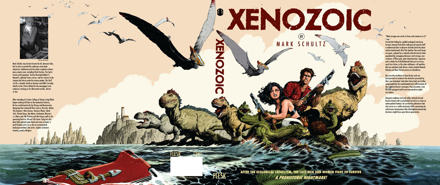

Final Cover Design

It's always a pleasure to work on projects with people who's work you admire. Xenozoic is certainly one of those projects. Mark Schultz's art is just plain beautiful to look at. When we started having dialog about how to go about designing this book, we decided the best approach, was to show a lot of white space on the new pages. Because Mark's artwork is so dense, it seemed to make sense to break things up with pages that would give your eye some resting places. So the approach was to simplify. With the chapter dividers, Mark did 20+ new illustrations, each representing an iconic interpretation of that story. The chapter title was discreet and slightly kerned out, giving it a look of sophistication. A small trilobite logo was placed at the bottom of the page to balance everything out.

The title page was set-up much the same way, with lots of white space. It's interesting how using white space becomes very much, a design element. I think too many times there is a desire to jam way too much information onto a page. What becomes the focal point? This way you can take in all the information, and possibly linger on it, longer.

There were a few changes to the final cover, one of them was obviously using Mark's painted version of his artwork. Mark also wanted to go back to the title type that wasn't angled, but still looked distressed. It represented something stronger and bolder. I think this falls into the same philosophy as the inside design, simpler is better. I think it's eye catching and very handsome as a final solution.

Check out John Fleskes blog (Flesk Publications) for a more in depth description of Mark's process of creating the cover illustration.

Sunday, September 5, 2010

Menagerie: The Art of Animals

First design for the invitation


Second design for the invitation


2 t-shirt designs based on design elements from the invitations


Final invitation design

In May I got a call from Joan Adan, curator for the Forest Lawn Museum. She gave me a call based on a recommendation from my good friend William Stout. She was wondering if I'd be interested in designing an invitation and show catalog for an exhibit that was opening up in August. The show was to be titled Menagerie: The Art of Animals, it was going to include original artwork by many very talented artists and illustrators. The list included, Drew Struzan, Ian McCaig, Marc Davis, Charles Russell, and Charles Knight. William Stout was co-curating the show, showing eight of his paintings, lending several pieces from his personal collection of other artists, and doing a new painting that would serve as both the cover to the invitation and the catalog.

What an enjoyable experience this ended up being. Starting out with a brand new beautiful painting by William Stout, it was hard not to be enthused about this project. Based on the painting by Bill, anything I did would end up looking good.

The first 2 invitation designs, I was trying to create an icon to go with the title. I wanted a symbol that could be used to identify and promote the show. I also thought it would be fun to create t-shirts to sell at the show or wear to promote the event. In the first attempt, I was playing off using a simplified version of Bill's beret wearing chimpanzee (think Paul Frank).

The second version, I wanted an elephant interacting with the type, as if it were holding up the word Menagerie. In both of them, I used a background that resembled a pattern that might be found on an animal (giraffe). Joan wanted to simplify the design, and felt with the icons, it was too busy. So the final attempt was to strip it down to it's most important basic elements and tweak the color to follow closer with the palette of Bill's painting.

Check out William Stout's website for a really neat process and explanation of how he did the final painting for the show.

Saturday, September 4, 2010

Award Winner

Well, I just found out, that The Rocketeer Complete Adventures Deluxe Edition won 3 Harvey Awards! I think that is quite exciting. Here's an explanation of who he is, and what they represent...

BALTIMORE, MD (July 11, 2010) -- The 2009 Harvey Awards Nominees have been announced with the release of the final ballot, presented by the Executive Committees of the Harvey Awards and the Baltimore Comic-Con. Named in honor of the late Harvey Kurtzman, one of the industry’s most innovative talents, the Harvey Awards recognize outstanding work in comics and sequential art. They will be presented August 28, 2010 in Baltimore, MD, in conjunction with the Baltimore Comic-Con.

Nominations for the Harvey Awards are selected exclusively by creators - those who write, draw, ink, letter, color, design, edit or are otherwise involved in a creative capacity in the comics field. They are the only industry awards both nominated and selected by the full body of comic book professionals.


It won awards for "Best Domestic Reprint Project," and also "Special Award for Excellence in Presentation" and Laura Martin won for best colorist on the project.


More exciting news, back in July, the book also won 2 Eisner awards. Here's an explanation on those awards...

The Will Eisner Comic Industry Award, commonly shortened to the Eisner Award, is a prize given for creative achievement in American comic books. It is named in honor of the pioneering writer and artist Will Eisner,and includes the comics industry’s Hall of Fame. Each category is nominated by a five-member panel, voted on by comic-book professionals, and presented at the annual Comic-Con International convention held in San Diego, California.

The book won the award for "Best Archival Collection/Project—Comic Books," and Laura Martin, once again won for colorist on this book.

I'm thrilled and delighted, It really was quite the team effort to put the book together. Thanks to Scott Dunbier for allowing me to do the book as I had envisioned. Also thanks should go to Kelvin Mao, who worked very hard (night and day) on doing whatever was necessary to see the book was done to the highest level of expectations.

How's that for a speech? Since I didn't get a chance to give one for real, I thought I would take the chance and do it here.


As far as the book goes, it sold out pretty quickly, however, the good news is, it is being reprinted. The image above shows the new variation on the slipcase for the book. This will help distinguish this from the first printing. Otherwise, everything else will be the same as the first printing. I think...this is coming out in October.

Sunday, June 6, 2010

Midget Racers Quarterly


Here's a cover to Midget Racers Quarterly, featuring Johnny Comet. So, you say you've never seen or heard of this magazine? That's because this is the only issue in existence. I thought it would be fun to put some promotional material for the book together for San Diego Comic-Con. I thought by creating this faux magazine, it would put some smiles on people's faces. I printed out four of these covers, trimmed them out, and then mounted them to 1950s era Hot Rod magazine guts. I added a little more aging to the cover and I think it looks pretty convincing. It sure smells convincing. Of course to preserve the whole illusion, I quickly made sure to insert the magazines into mylar sleeves. These will be on display at the Vanguard booth, along with Johnny Comet pit crew T's and packaged balloon racing cars. It's all for fun!!

Johnny Comet spreads

The spread intoducing the Sunday strips


The spread introducing the daily strips


A page dividing one of the sections of the book


The title spread to the book


Can I be honest? I'm so loving working on this Johnny Comet book. What a great opportunity to be able to design a book dedicated to one of Frank Frazetta's comic strips. I really love everything about this strip. I'm a big fan of the 50s era. I think the best designed cars came from that period, along with furniture design, and graphic design. It's been a joy, to try to take existing Frazetta art, and give it a whole fresh new approach.

One of the design approaches was to collage his illustrations with actual photographs from that era. It kind of gives the illusion that the situations and cast of Johnny Comet were part of history. I also wanted to throw in car ads and other images to give reference to that time. These represent just a few examples of the design work going into the book.

The Strand Book Store NYC


A couple of months ago, I came across a contest to design canvas tote bags for the Strand bookstore in New York City. They had hired several different comic books artists (including Seth and Adrian Tomine) to do a new bag each year in the past. However, this year they had a contest to determine who would provide the art for their new bag. I thought the prizes were pretty cool, (hundreds of dollars worth of books from Fantagraphics, and Drawn and Quarterly, plus the exposure of your artwork on the bag) so I decided to enter. I noticed that Francoise Mouly, who is the art editor for the New Yorker, was one of the judges. I was hoping, to maybe get some opportunity, through some fluke, to possibly do work for her. Anyway, with all these possibilities, I decided to enter the contest.

These things are always a little tricky, because you don't know the personal taste or what might appeal to the judges in a contest like this. It could have something to do with what they ate that day or what kind of mood they were in. I tried to spread out my design style as much as possible, to give me the best chances.

The first design was an attempt to be clever around the idea of a bookworm. I pushed the whole retro feel with colors and iconic images. I thought it would look good as a strong graphic image and advertisement on the side of the bag.

The second one was more of a bouncy, cartoony, contemporary approach. Again I wanted this to be a strong, graphic, highly visible image when printed on the bag. I thought the idea of "What's your story?" was kind of funny with its double meaning.

The third design was meant to be more childlike in its execution. It's big, bold, and simple in it's shapes and form. I wanted it to be cute and heartwarming. I thought it was the most sentimental of all of the designs. I felt it kind of had a European feel to it.

So here's the good/bad news, there were over 800 entries into the contest. Out of that many participants, 2 of my designs were placed in the top 20. The first and second design made the cut. When I was informed that I had "won" they requested I provide them with hi-res versions of the art so they could use it in a slide show sponsored by the School of Visual Arts. They were also going to post the winners on line and some other stuff, which I don't remember. I told them I was going to pass, when I was asked why, I told them I entered the contest to win first place, which I hadn't, so why continue to be part of this. I don't want to sound like a sore loser, but really, what would the point have been? Who remembers runner-ups?

After looking over the designs, I don't think I would have done anything differently. You can never predict what is going to appeal to anyone. I think ultimately, you have to stay true to your own vision, and feel content that you did the best job you could. I'm actually okay with that.

Maybe next year...

Monday, May 17, 2010

The Rocketeer Artist's Edition

This is the cover to the new Rocketeer Artist's Edition book


This is the endpapers for the front part of the book.


This is the title page for the book


This is the credit page spread for the book


This is a sample page from the book


This was IDW's editor Scott Dunbier's dream project. This book contains the original artwork from the entire Rocketeer story shot at original size. That means the size of the book is 12" x 17." It is spectacular in it's enormity. The book weighs in at about 4 pounds. It is a hefty, beefy, masculine volume.

Even though the artwork is basically black and white, all the pages were scanned in color. Because of this, you can see all the blueline art that was part of the creation process. This is the closest you can come to looking at a Dave Steven's original without owning one. When it comes to illustration work, I'm kind of a process junkie. I love seeing all of the peliminary sketches and design that go into creating a page of art. These pages are certainly an eye opening experience. The detail that Dave puts into each panel can only be appreciated at it's actual size. It was almost like discovering his art for the first time. His ability to create atmosphere and character expression, along with the craftsmanship of inking with a brush really shines on these pages. This takes the idea of "funny books" to a whole new level. The stuff is really beautiful!

The book will be sold directly through IDW, so check out their website. I have a feeling this will sell out rather quickly, remember the Deluxe Edition of the Rocketeer? The price on it is $100.00, not really cheap, but certainly worth it for something as unique and beautiful as this.